


Before…

And After!
a mini makeover
As much as I would love to do a complete redesign on the USCutter homepage (with large photos and more pronounced CTA’s), there are instances where you don’t have the time or resources to do everything you’d like to do. To do a complete redesign would have involved rebuilding the site templates in the back end of the ecommerce platform we were on, and that was not a priority for the company at the time. Working within the constraints of the existing template, I still wanted to find a way to streamline the brand experience via the site’s front page. The solution I came up with involved maximizing the window’s white space and using green as the main brand color. The red was scaled way back, only used very sparingly as a secondary accent. It may not be a complete overhaul, but it’s amazing how a few simple design choices can create a dramatically new aesthetic experience for a brand.
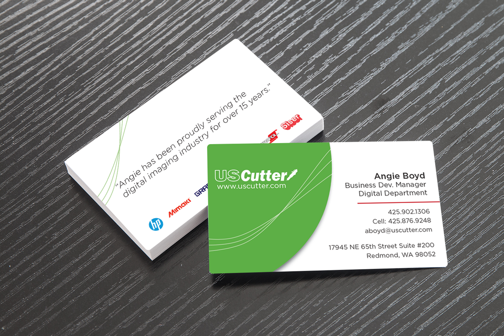
The new brand experience translated into business cards…
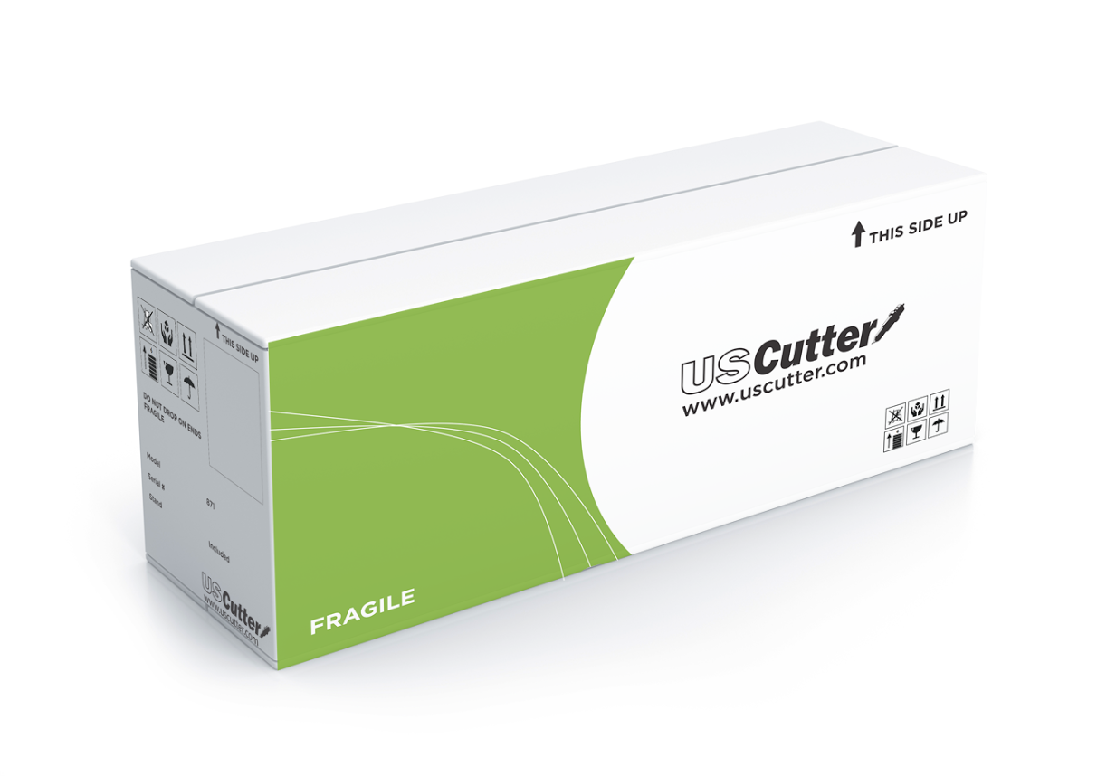
The brand consistency also extended to the shipping boxes.